Bootcamp Notes – Day 4 (Mon) – Bootstrap: CSS Components


Bootstrap: CSS Components
Today, we will be learning about bootstrap components. Bootstrap components are a set of classes that help you create many common parts of a user interface. The source code for these components can be based in purely CSS or a combination of CSS and JavaScript. We will be looking at purely CSS-based components.
Color and Spacing Utility Classes
Bootstrap provides us with many utility classes we can use for basic color and spacing, sizing, borders and more.

As you can see from our link to the list, there are only just a handful of basic colors. So if you want to use any colors that are not included here, you won’t be able to use these classes. You’ll have to write custom CSS. To use these classes you can add them to any element.
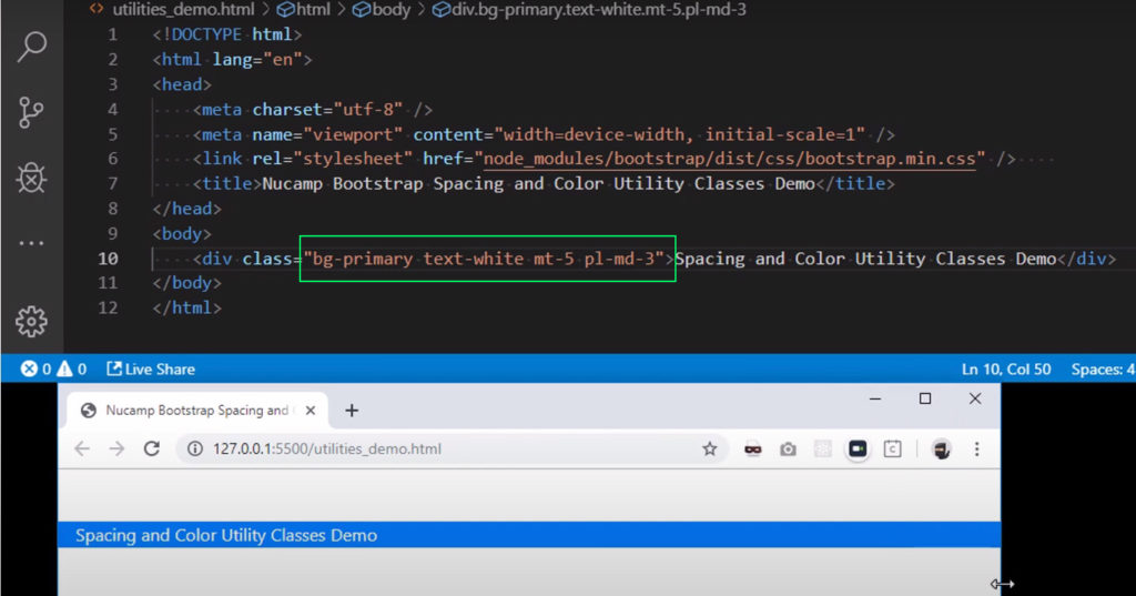
Example: <div class=“bg=primary text-white”>
Bootstraps spacing utility classes allow you to easily set basic margins and paddings on any elements. To use them, combined either m for margin or p for padding the sides of the element that you want to affect, then you add a hyphen and a number for the amount of margin or padding that you want from 0 to 5 and you have the option of auto for margins. You can also set up breakpoints if you want the spacing to be responsive. If you don’t set a breakpoint the class will be applied to all view port sizes.
How it works
Assign responsive-friendly margin or padding values to an element or a subset of its sides with shorthand classes. Includes support for individual properties, all properties, and vertical and horizontal properties. Classes are built from a default Sass map ranging from .25rem to 3rem.
Notation
Spacing utilities that apply to all breakpoints, from xs to xl, have no breakpoint abbreviation in them. This is because those classes are applied from min-width: 0 and up, and thus are not bound by a media query. The remaining breakpoints, however, do include a breakpoint abbreviation.
The classes are named using the format {property}{sides}-{size} for xs and {property}{sides}-{breakpoint}-{size} for sm, md, lg, and xl.
Where property is one of:
m– for classes that setmarginp– for classes that setpadding
Where sides is one of:
t– for classes that setmargin-toporpadding-topb– for classes that setmargin-bottomorpadding-bottoml– for classes that setmargin-leftorpadding-leftr– for classes that setmargin-rightorpadding-rightx– for classes that set both*-leftand*-righty– for classes that set both*-topand*-bottom- blank – for classes that set a
marginorpaddingon all 4 sides of the element
Where size is one of:
0– for classes that eliminate themarginorpaddingby setting it to01– (by default) for classes that set themarginorpaddingto$spacer * .252– (by default) for classes that set themarginorpaddingto$spacer * .53– (by default) for classes that set themarginorpaddingto$spacer4– (by default) for classes that set themarginorpaddingto$spacer * 1.55– (by default) for classes that set themarginorpaddingto$spacer * 3auto– for classes that set themarginto auto
(You can add more sizes by adding entries to the $spacers Sass map variable.)
$spacer <—- This spacer variable you see here is set to a default of 1 REM, which is equal to the font size of the HMTL element which by default is usually 16 pixels.
1 rem = usually 16 px
Example: <div class=“bg=primary text-white mt-5“> (This will increase the margin top)
Example: <div class=“bg=primary text-white mt-5 pl-3“> (This will increase the padding left side)
Example: <div class=“bg=primary text-white mt-5 pl-md-3″> (This will make it responsive. Now the padding only appears on medium and up viewports)
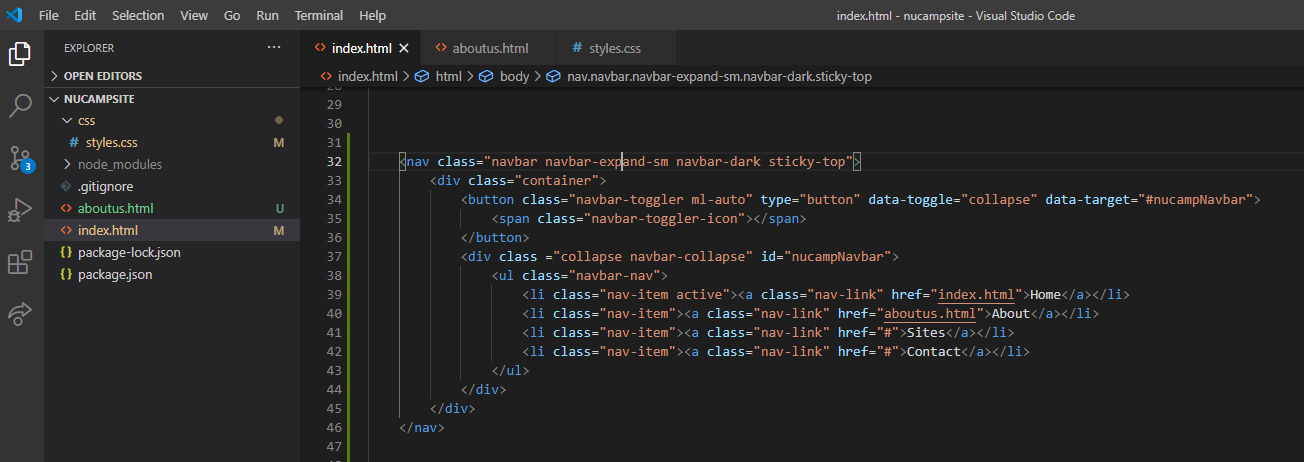
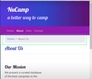
Overview: Navigation
You are most likely familiar with the concept of nav bars. You rarely run into a a website without a navbar anymore, which is typically a horizontal bar across the top that contains links to the main pages of a website. Bootstrap’s navbar component can easily be made responsive so it shrinks into a toggler on a smaller smaller viewports.
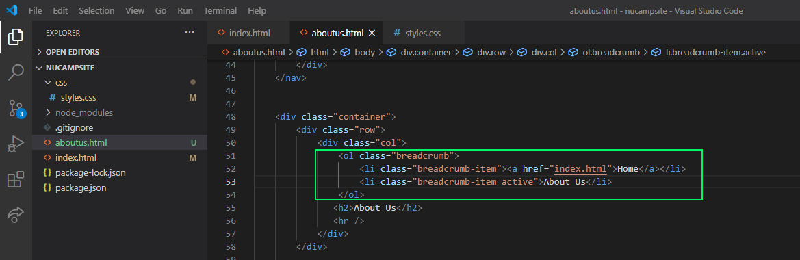
Types of Breadcrumbs
Now what about the term breadcrumbs? Goes back to the story of Hanzel and Gretal leaving breadcrumbs on the ground to find their way back home.
Their are three basic types of breadcrumbs:
Location: static, show where the page is located in the website hierarchy, eg. Library > Events
Attribute: give information that categorizes the current page based on attributes by the user, e.g. Rugs > Round
Path: Show users the steps they took to get to the current page – also known as a “history trail” – tend to be confusing and thus least often used.
Some Do’s and Don’ts of Navigation Design
- Do use user-friendly, simple terms. Ex “About US” instead of “Corporate Profile”
- Do be consistent – provide the same navigation throughout your website.
- Do ensure that clicking the name/logo of your website in the header should take users back to the homepage.
- Don’t clutter your main navigation with too many options. Use submenus if necessary, but sparingly.
- Don’t use vague terms. Be as specific and descriptive as possible – e.g “Tours” instead of “Services”.
- Don’t make it difficult for users to figure out where they are in the hierarchy of your website.
Navbar code example below. Full code here to view.
Breadcrumbs code:
Breadcrumbs working in example:
Icon Font:
Way back when, web Developers once used image files for icons. To change the color or other styling for an icon, it was necessary to create an entirely new image file. But now web developers have two very good options to choose from: icon fonts or SVG icons. For now will cover icon fonts. Icon font’s are typically bundled together into toolkits such as the very popular font awesome library. Font awesome is not a part of bootstrap but a separate library. By using an icon font toolkit such as this you can immediately have access to many icons because each icon is treated like a character from a regular font set, they can be styled using CSS just like any regular font unlike static images.
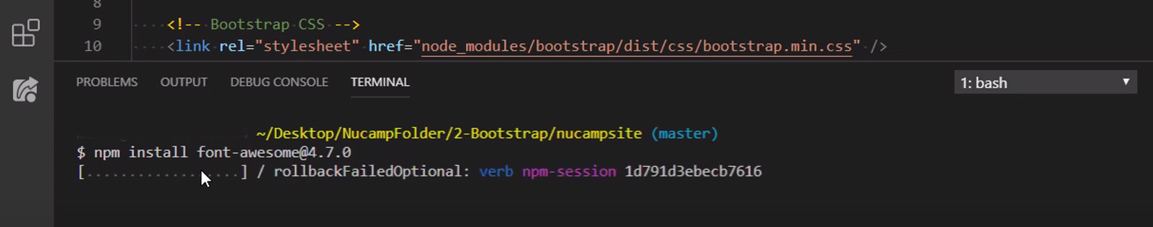
Now to install font awesome will use our VS Code terminal again!
Type in Bash terminal: npm install font-awesome@4.7.0
 <!-- Additional CSS must be placed after Bootstrap CSS -->
<link rel="stylesheet" href="node_modules/font-awesome/css/font-awesome.min.css" /> Font Awesome Code Example:h5>Social</h5>
<a href="http://instagram.com/"><i class="fa fa-instagram"></i></a>
<a href="http://facebook.com/"><i class="fa fa-facebook"></i></a>
<a href="http://twitter.com/"><i class="fa fa-twitter"></i></a>
<a href="http://youtube.com/"><i class="fa fa-youtube"></i></a>
Icon fonts are far from obsolete. While they are not always the most efficient nor the most reliable option, icon fonts are still relatively simple and easy to implement therefore many developers continue to use them. Depending on the number of icons used, It may not be worth the effort to switch out icon fonts for SVGs on your older projects; however, SVGs are the definitive way of the future, so you might as well get comfortable using them going forward.
Buttons
And ad this to head:
<link rel="stylesheet" href="node_modules/bootstrap-social/bootstrap-social.css" />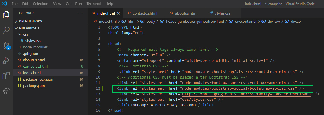
Code Example:
<h5>Social</h5>
                    <a class="btn btn-social-icon btn-instagram" href="http://instagram.com/"><i class="fa fa-instagram"></i></a>
                    <a class="btn btn-social-icon btn-facebook" href="http://facebook.com/"><i class="fa fa-facebook"></i></a>
                    <a class="btn btn-social-icon btn-twitter" href="http://twitter.com/"><i class="fa fa-twitter"></i></a>
<a class="btn btn-social-icon btn-google" href="http://youtube.com/"><i class="fa fa-youtube"></i></a>FORMS
Additional Resources:
- Bootstrap Color Utility Classes
- Bootstrap Spacing Utility Classes
- Sitepoint – Understanding and Using rem units in CSS
- 6 Website Navigation Best Practice Do’s and Don’ts
- 10 Steps For Better Website Navigation
- How To Use Breadcrumbs
- Bootstrap – Navbar
- Bootstrap – Breadcrumb
- W3Schools – <nav>
- CSS Position Sticky – How It Really Works
- W3Schools – data-* attributes
- MDN – using data attributes
- How To Use HTML5 Data Attributes
- Font-Awesome Icons 4.7.0 – the version we are using
- Font-Awesome Icons – free icons from the latest version
- Sitepoint: Introduction to Icon Fonts
- Bootstrap Text Color Utility Classes
- KeyCDN.com: Icon Fonts vs SVGs
- Bootstrap Buttons
- Bootstrap Forms
- Bootstrap-Social
- The Difference Between Anchors, Inputs, and Buttons
- MDN – creating a phone link
- MDN – creating an email link
- Bootstrap Forms
- Bootstrap Buttons
- Bootstrap Grid – Nesting
- W3Schools – Radio Buttons
- MDN – Labels