Bootcamp Notes – Day 5 (Tues) – Bootstrap: Display Content

Bootstrap: Display Content
Tables and Cards
Bootstrap offers several ways to display content, including Tables and Cards. Tables are an existing HTML element that can be customized with Bootstrap classes for convenient styling and responsive behaviors. Cards do not pre-exist in HTML, but like Bootstrap grids, can be created using Bootstrap classes and div elements.

Bootstrap tables and cards are two common ways to display content on a webpage.
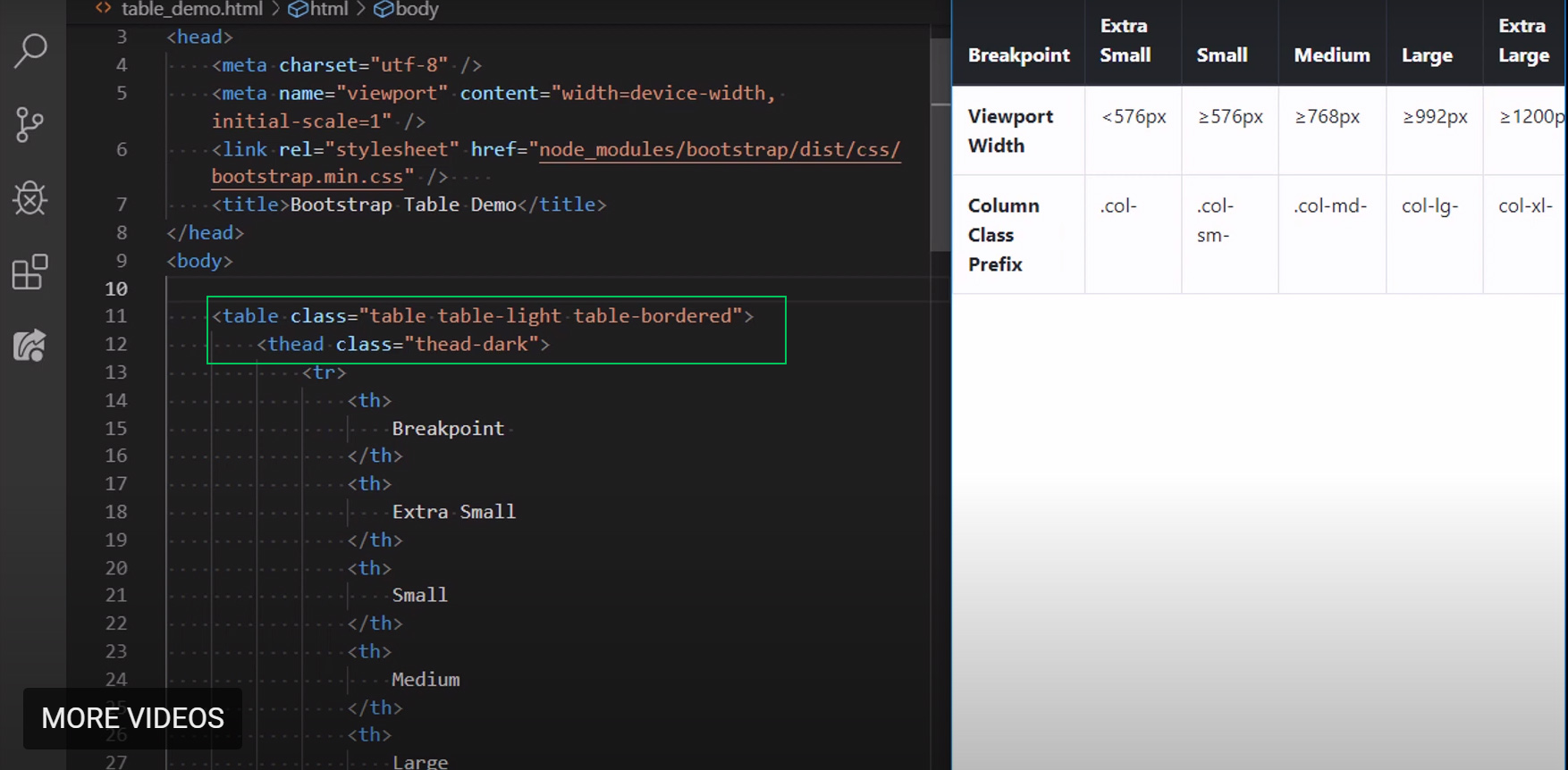
In the early days of web development, html tables were often used for web page layout. But now we have better tools for layout with CSS. HTML tables should now be used as they were originally intended for tabular data – that is information presented in a two-dimensional table comprised of rows and columns of cells containing data.
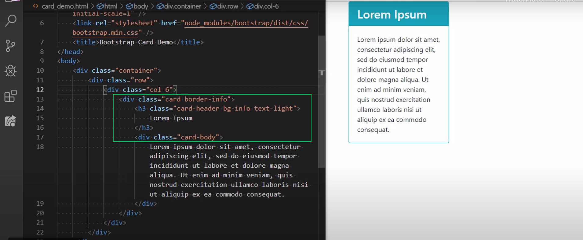
Bootstrap Cards
The bootstrap card component is a lightweight flexible way to set up data from the rest of the page.
Bootstrap table responsive
Responsive tables allow tables to be scrolled horizontally with ease. Make any table responsive across all viewports by wrapping a .table with .table-responsive. Or, pick a maximum breakpoint with which to have a responsive table up to by using one of .table-responsive{-sm|-md|-lg|-xl}.
More about tables with bootstrap here.
Images and Media
Bootstrap makes it easy to create responsive images and add a lightweight thumbnail style with its image classes. The Bootstrap media object classes help you control the relative positioning of media next to text content. There are only a couple of classes specifically for images.
The main one to know is the image fluid class. When the width of an image is bigger than the width of the viewport, what happens? It gets cut. You have scroll. So if you want it to fit with the resizing and behave responsively we could use two CSS styles:
max-width: 100%; — (This means that this image can never be larger than 100% of its parent element, so it will never be wider than it’s viewport allows
height: auto; — (The height scales proportionally if the image needs to shrink in width)
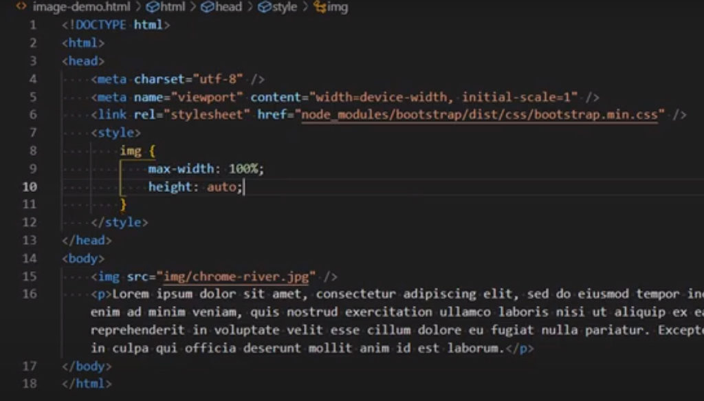
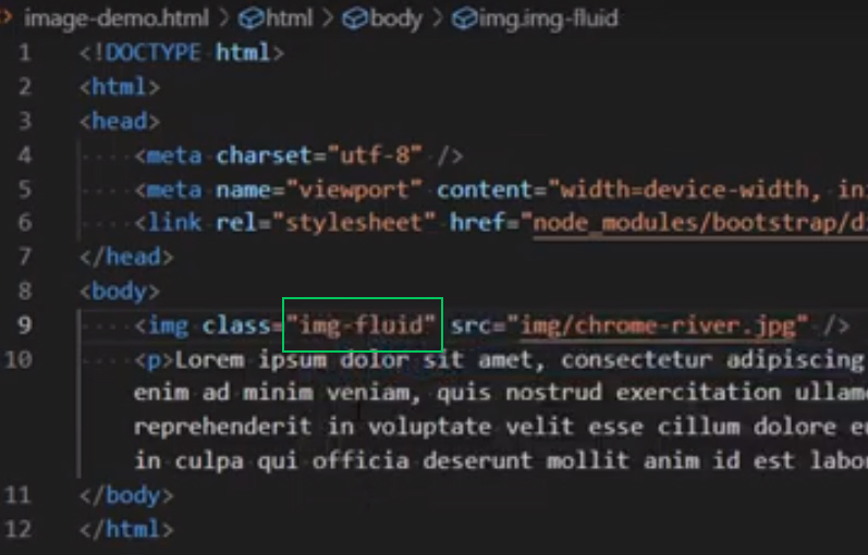
But with Bootstrap we have a shortcut. We don’t need that style code. It has it by using: img-fluid
img-thumbnail can be used to give the image a one pixel border and rounded corners.
Media Object Classes
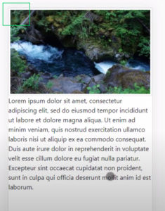
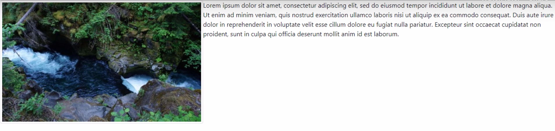
Lets say that we wanted this image and the text to be next to each other.
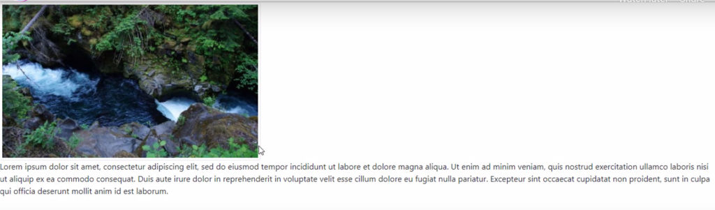
We would use the media class like this example code:
Which used, will get you this to display. You can read more about media object here: Bootstrap Media Object
Project Code Examples here at CodePen:
Additional Resources:
- MDN – Tables
- W3Schools – <thead>
- Bootstrap Tables
- Bootstrap Cards
- Wikipedia – Lorem Ipsum
- MDN – Tables
- Bootstrap Tables
- Bootstrap Cards
- Bootstrap Description List <dl> Alignment
- Bootstrap Spacing Utility Classes
- Bootstrap Color Utility Classes
- Bootstrap Images
- Bootstrap Media Object
- W3Schools – max-width, height, CSS Flexbox
- Bootstrap Forms
- Bootstrap Form Controls
- Bootstrap Grid
- W3Schools – <select> and <option>
- MDN – Label