Bootcamp Notes – Day 6 (Mon) – Bootstrap: JavaScript Components


Bootstrap JavaScript Components
Many of Bootstrap’s components are built with, or extended by JavaScript plugins, such as tooltips, modals, and more. While you can write actual JavaScript code to customize Bootstrap components further, you will be exploring how to use HTML5 custom data attributes to access the JavaScript plugin functions, without needing to write a single line of JavaScript.
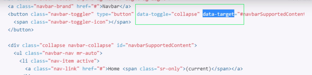
Many Bootstrap components use JavaScript plugins for greater functionality. Most of the time, you do not need to write any JavaScript yourself to use plugins. Instead, Bootstrap has defined HTML5 custom data (data- *) attributes you can use to access and configure the JavaScript plugins through HTML.

HTML5 custom data- * attributes
What are data attributes? Data attributes were introduced in HTML5. Custom data-* are new in HTML5. They are simple but powerful concept – allow you to create custom attributes to store any data you want in any HTML element, then later access them via JavaScript or CSS. HTML5 data attributes allow you to create custom attributes for any extra information that you want to store inside any HTML element then you can easily access those attributes using JavaScript or even CSS. To create them, use the attribute name of data- plus a string (must be at least one lower case character) of your choice.
Example: data-whatever (Codepen example here of it in use)
So based on the example, this is a way to store data inside any element or later to use. Bootstrap’s JavaScript plugins make heavy use of these data attributes that have been customized by bootstrap instead of writing JavaScript yourself. You just have to add the right data attributes and all the JavaScript happens beneath the surface for you. Below is example code from Bootstrap navbar.
The Nav Component
The Nav Component is used to set up different kinds of navigation interfaces using either the ul or nav element and the class of “nav“. It includes simple sets of links (horizontal/vertical), or more complex tabs or pills, which with JavaScript plugins can be extended to create panes of content. Use Bootstrap’s built-in custom data attributes to do so without needing to write any JavaScript yourself.
Collapse Component
The collapse component is designed to help you toggle parts of a webpage in and out of view. The component is designed to be highly flexible with the help of JavaScript plugins, which can be used with data attributes, as well as extended with custom JavaScript. You can use Bootstrap Card component to create a type of collapse called an Accordion.
Accordion uses the collapse components behavior of hiding and expanding content and extends it to create a set where when you click on one card it expands and hides the other cards. Accordion example here to view with code.
Tooltips and Popover
When you hover over an element with a mouse and some text pops up to give you more information about it. Popovers are a similar concept except that you need to click on the element in order to see the information rather than just hovering over it. Bootstraps tooltip component is a JavaScript to enable its behavior. In fact it’s one of the main reasons why we installed popper.js
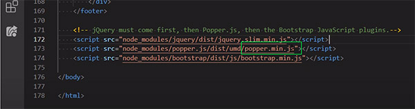
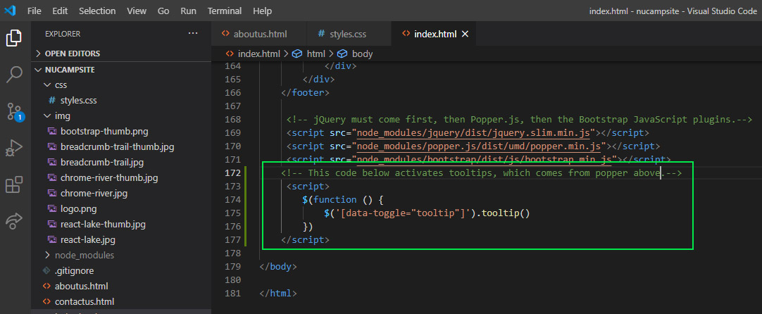
Popper is the library that’s required for popovers tooltips and most drop-down menus in bootstrap. Tooltips are opt-in and won’t work on page without first being initialized for performance reasons. So we need to add some JavaScript in the form of jQuery that bootstrap provides to initialize tooltips.
This is the JQuery method that activates all tooltips for this page.
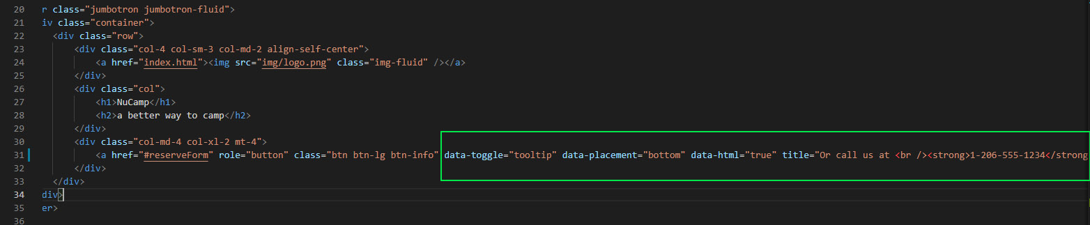
The tooltip component is not built with classes. Instead it is built using custom data attributes.
As you can see below, the Bootstrap-provided attributes that were added were: data-toggle, data-placement, title, and data-html. The minimum two attributes you need to add to create a tooltip are the data-toggle=”tooltip” and title attributes. The title holds the text for the tooltip. The other two tooltip-related attributes we used above are optional. The data-html attribute allows you to use HTML inside the title. The data-placement attribute lets you specify the location relative to the element where a tooltip displays itself – to the top, right, left, or bottom. There is also an auto option that reorients the tooltip placement dynamically as needed.
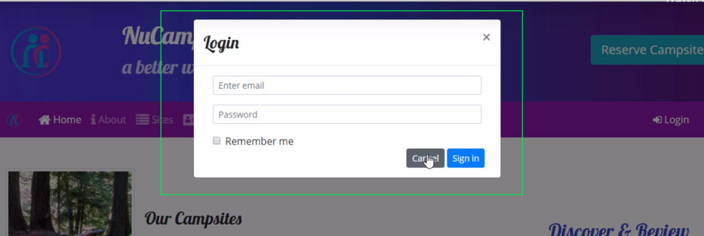
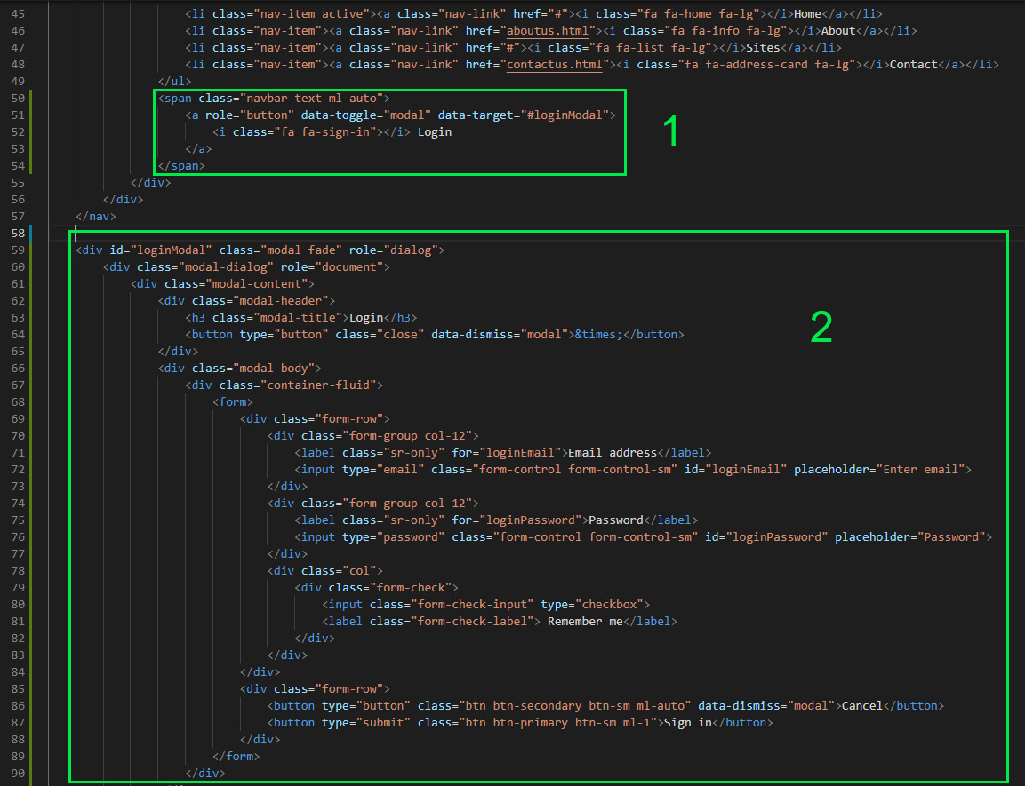
Modals
A modal is a smaller dialog window that opens on top of a parent window and disables the parent window until the modal is closed, while still keeping the parent window partially visible behind it. Modals can be used to display, login dialogs, user notifications, images or whatever you like. Unlike a boring JavaScript alert window, a bootstrap modal is fully customizable.
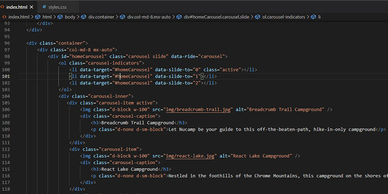
Carousel
A carousel is a looping slideshow that cycles through a set of content which can be text images or both. It’s a more complex JavaScript component. With Bootstrap’s custom HTML data-* attributes and component classes, you can build a carousel with indicators, manual controls, captions, and more.
SPAN vs DIV: The main difference is that the <span> tag is an inline element, whereas the <div> tag is a block level element. Two block level elements (divs) will be displayed one after each other vertically, whereas two inline elements (spans) will be displayed one after each other horizontally.
Additional Resources:
- Bootstrap – JavaScript
- MDN – Use data attributes
- WHATWG HTML Living Standard specification on custom data attributes
- Bootstrap Nav
- Bootstrap Collapse
- Bootstrap Accordion Example
- Bootstrap Tooltips
- Bootstrap Popovers
- Bootstrap Modals
- Bootstrap Forms
- Bootstrap Carousel
- Bootstrap Carousel
- Bootstrap Display Utility Classes
- Bootstrap Sizing Utility Classes
- Bootstrap Spacing Utility Classes – Using mx-auto for horizontal centering
- Bootstrap Grid – Using col-auto for variable width content
- MDN – CSS background color
- RGBA and Hex Color Converter