Dropdown Sidebar Menu Responsive Bootstrap Navigation


Dropdown Sidebar Menu Responsive Bootstrap Navigation
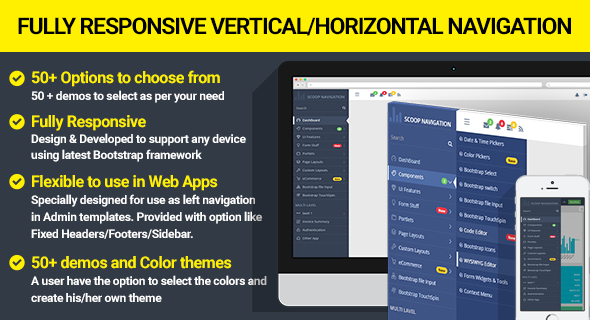
Scoop Navigation Menu Consist of both Horizontal and Vertical navigation with customize options and themes. It can be used for all type of web applications like custom admin panel, project management system, admin dashboard, application backend, CMS or CRM. Its lightweight and compatible with almost all major browsers and devices. this plugin make more then 40 plus navigation view. It supports four level sub menu with shrink, Overlay and push effect.
THIS IS NOT A WORDPRESS PLUGIN
Multi purpose Responsive Scoop Navigation supports multi navigation style like Expanded, Compact, Collapsed, off-canvas, full-page Menu, Full Mega Menu, Half Mega Menu and Search bar on navigation. Three new navigation style introduce in this plugin like ex-popover, Sub-Expanded and full drop Menu
Scoop Menu fully responsive on any device like a phone, tablet, and desktop. User can set default or change any navigation on window load and sidebar toggle. Scoop Navigation is Designed and developed to support any bootstrap or non-bootstrap framework. it is Flexible to use in Web Mobile Apps.
Plugin Features:
- Design & Developed for any device
- Easy to Use and Very Customizable
- Single code work for all device
- 100% Responsive and Mobile Friendly
- Bootstrap Framework & Non Bootstrap Framework
- Customizable Menu Trigger on each level
- Click Trigger and Hover Trigger
- Drop Down Menu with toggle effect
- Multiple SubMenu levels
- Vector Icons Included, fontawesome Icons,simple line icons
- light weight & No image needed
- Easy Integration for your Web Projects
- Varieties of Navbar theme
- It has Expanded Menu for desktop,Tablet and phone
- It has Collapsible Menu for any device
- It has Compact Menu for any device
- It has Fullpage Menu for any device
- It has Sub-expanded Menu for any device
- It has Ex-Popover Menu for any device
- It has Off-Canvas Menu for any device
- It have Horizontal Navigation Menu
- Sticky Horizontal Menu
- Centered Horizontal Menu
- Top, bottom Horizontal menu Placement
- Left, Right Vatical menu placement
- It has Push responsive Menu Mode
- It has Overlay responsive Menu Mode
- It has shrink responsive Menu Mode
- Customizable dropdown indicator
- Customizable Border Style
- Customizable Menu Layout : wide, box and wide box
- Scrollbar on Vertical Navbar to manage long Menu items
- Searchbar on both Horizontal & vertical navbar
CREDITS
- jQuery
- Bootstrap
- FontAwesome
- simple line icons
Change Logs
March 25, 2017
- Fixed all Internet Explorer 9 and safari Browser Issues

March 17, 2017
- initial release


