Blog Design Switcher

Plugin for Blog design customization for any type of WordPress \ Woocommerce theme.
This ultimate extension for managing the design of the Blog pages: Blog, archives and single posts.
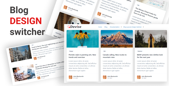
Easily change and customize your Blog page, archives, and Post pages layouts with Blog Layouts Design switcher produced by Web Devise.
Easily choose Blog layout output and use customization options to design fonts, colors, sizes.
The plugin provides the opportunity to customize a Single post to make the output as you need. For single posts you could also set up Font styles and choose different skins for the Post title.
All options integrated to Customizer. All changes you could see and change in real-time.
The current plugin works with Blog page and archive pages also, it means your changes for the main Blog page will be applied to the archive pages in the same style.
Blog Design switcher works with the whole PHP template of the page except the Header and Footer, so in this way, you could save your website identity using this plugin.
For saving your website identity by default, the plugin uses your initial options for fonts from your theme, but you could set up your own options and styles now for Blog related pages. Also, the plugin doesn’t manipulate the comments, so you’ll have Comments looks according to your theme code.
Mobile-first.
We pay attention to mobile-first principles to make your Blog nice on all mobile devices. All elements in Blog design are adaptive. All design and layouts are done from the mobile usage point of view to make max interaction for your users with your Blog.
Blog Layout types
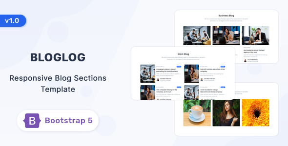
The plugin provides the opportunity to choose the Blog layout designs from predefined types: List, Grid, Masonry.
For layouts you could switch on / off:
-
Posts category
-
Author avatar
-
Author name
-
Post date
-
Excerpt
-
Choose sidebar position
Grid
-
The Grid output provides the opportunity to present Blog posts in the grid format. It could give your users good navigation and interaction with the Blog.
-
We programmed 2,3 and 4 columns for posts to make the design smooth in this case.
List type
-
The list style is one of the classical views to provide good navigation through content when you need focus line-by-line user interaction with content.
-
For the list-style Blog output, you could choose the Thumbnail position Left \ Right. It could give you 2 principal different looks as a result. We recommend making experiments with this option to see the best solution for you.
Masonry type
-
Masonry style is good when your content is not well organized or you’d like to underline your creative approach in your Blogging.
-
Masonry type of output as a Grid has option for outputting content in 2,3 and 4 columns.
Single Post
Title
-
Single post options have the option to choose designs for the top Title.
-
You could change the Typography output
-
For the Title output design projected option to switch on \ off: the date, author name, meta tags, and category
You could manipulate the width of the article content.
To change the width of the content area you could use padding to make the content look nice. It’s done for cases when you won’t need to use a sidebar and would like to make your content readable on the wide screens. We recommend setting up padding in % to have a nice look on all devices.
Blog Sidebar
All templates in the plugin include the opportunity to switch on \ off sidebar for the Blog pages and Single post, and have the option to use different sidebars.
