Bootcamp Notes – Day 3 (Wed) – Bootstrap: Responsive Web Design

Responsive Web Design
What is responsive mobile first? What does it mean? Well, way back before smartphones everyone surfed the web on computers which of course have larger screens. So web pages were designed with larger screens in mind. But now we have a big trend towards people using smartphones and tablets more then desktop computers. In the US currently, more than 50% of the website visits are from mobile devices. This number is projected to keep increasing.
Web developers used to create websites with the desktop version as the first priority, then adapting it for the smaller mobile view. There has been a shift to mobile-first design: developing for the mobile version first, then adapting it for larger screens after.
Responsive web design is a related concept. A responsive site one that dynamically adjusts its content based on your device size. That means a page will automatically resize, shift, and even hide or reveal certain content that is best for the current device. Rather than creating different webpages for different devices, one page can adapt to multiple devices.
Your Chrome browser under inspect (In developer tools) has a button to see what it looks like in different views.
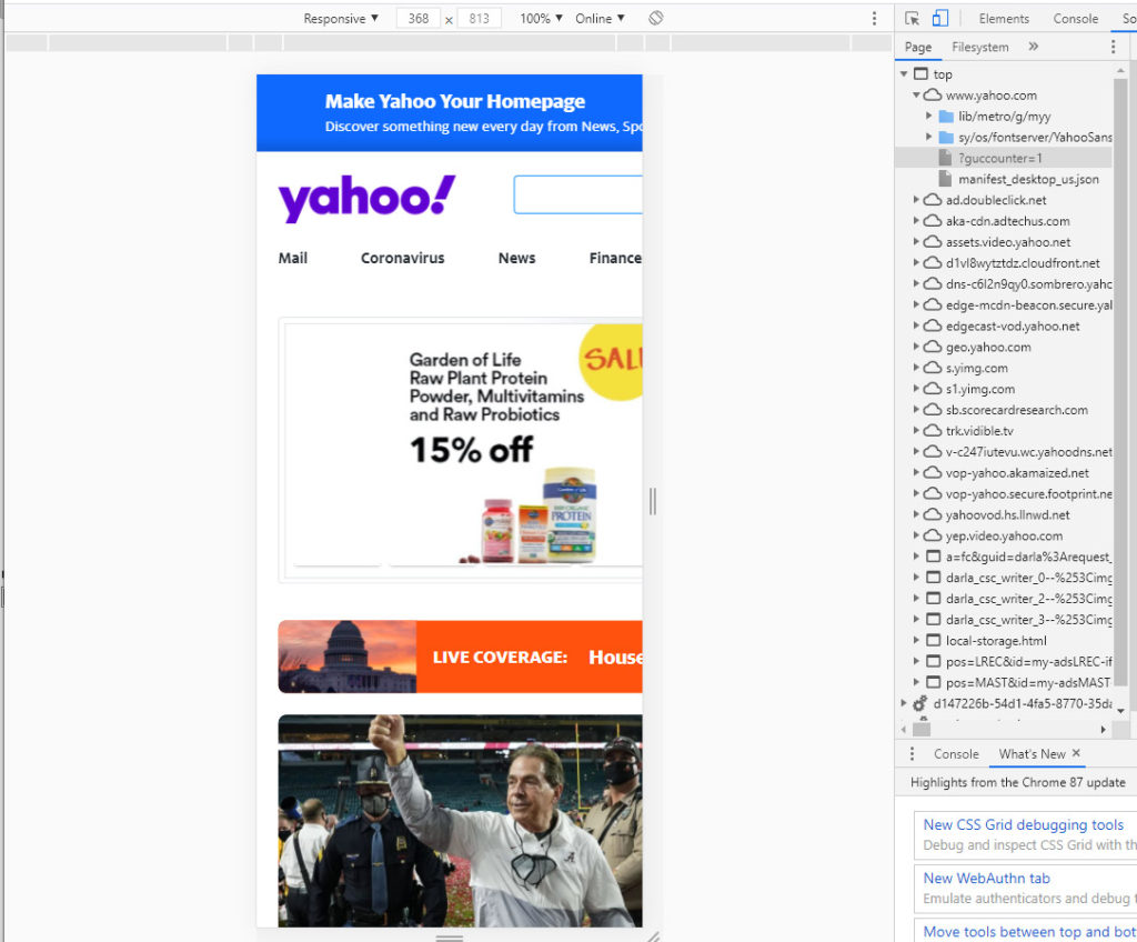
What is your viewport? In the simplest terms, it’s a visible area of a web page in browser given in width and height in pixels. However it is not always the same as your screen resolution for example:
iPhone X screen resolution is 1125 x 2436 pixels
iPhone X viewport size is 375 x 812 pixels
Now why this difference? That’s because screen resolution also takes in account something called pixel density or PPI pixels per inch. Just realize, the resolution of a screen is not always the same as the viewport especially on mobile devices.
The viewport does not include parts of the browser such as the address bar, scrollbar, bookmarks bar, et ,….
<meta name=“viewport” content=“width=device-width, initial-scale=1” /> This will be the the typical way to set up your meta tag there.
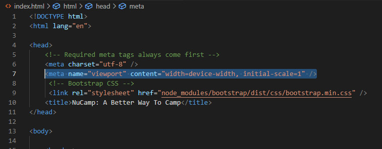
Responsive design with media queries and breakpoints
Once the viewport meta tag is set your webpage can now use media queries. Media queries are a powerful new concept in css3 and a fundamental concept of responsive web design. Media queries let you access the current size of the viewport and to set up different set of CSS rules based on the current size using the @media rule.
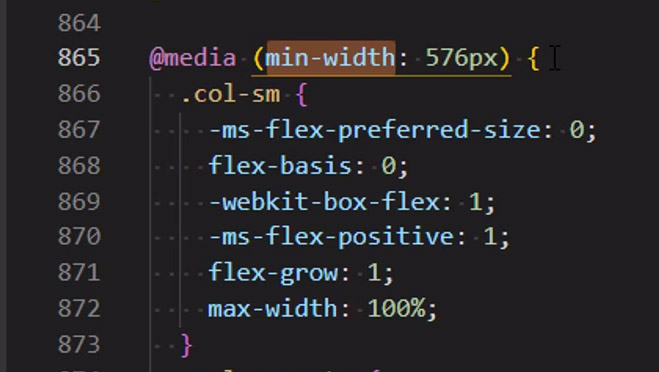
Media queries have many uses, but one of the most important, is they are used in setting up breakpoints. A breakpoint is a custom viewport width at which you want to change the appearance of the website. For example it might say when the viewport for our device is above a certain width, then it will put two columns side by side and show this text menu. When it’s below a certain width then stack the columns and hide the menu.
Bootstrap has done most of the hard work for you when it comes to media queries and breakpoints. You do not actually have to configure any media queries at all in bootstrap. You can use the ones the Bootstrap has already set up for you. Bootstrap by default has breakpoints set up for small, medium, large and extra large, which are configured to be these below:
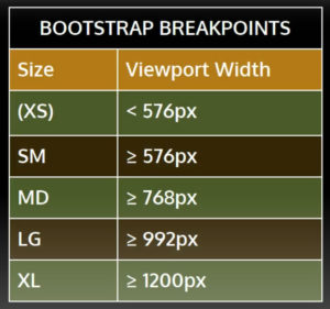
Again you don’t have to set up breakpoints yourself, you just have to learn how to use the bootstrap classes that use these breakpoints such as this one: .col-xl
- Remember, Bootstrap is a framework built on mobile-first, responsive design principles.
- Mobile-first means developing first for the mobile version, then adapting for larger viewports.
- Responsive design means using responsive utilities such as the viewport meta tag, media queries, and responsive images to render a different, optimized view for different devices these principles are built into the Bootstrap.
Additional Resources
- Read this article from Forbes for statistics and insights on mobile web usage
- Some words on mobile-first design
- W3Schools – Responsive Web Design – The Viewport
- W3Schools – @media rule
- What’s the viewport of your current device? Find out at: http://viewportsizes.mattstow.com/mine
- A list of common viewport sizes: http://viewportsizes.mattstow.com/
- On CSS pixels: https://juiceboxinteractive.com/blog/a-pixel-is-not-a-pixel-designing-for-a-new-generation-of-mobile-devices/


