Bootcamp Notes – Day 3 (Wed) – Bootstrap: The Bootstrap Grid

The Bootstrap Grid
The Bootstrap Gird is a core feature of Bootstrap. It is a way to create a grid layout for a page to control where elements are placed. Similar to the concept of an HTML table – HTML tables were once used for layout purposes, but today there are better tools for this such as the Bootstrap Gird. Today, tables have returned to their intended use (displaying tabular data) and should not be used for just layout purposes.
The Bootstrap Grid is designed as a mobile-first, responsive layout, based mostly on CSS (especially CSS Flexbox) along with media queries to set breakpoints.
To create a Bootstrap Grid you will always use this:
<div class=“container”>
<div class=“row”>
<div class-“col”> (column)
Your content for a grid, such as text or images must go inside a column. The container is just there to hold the rows. The row are there to hold the columns. All your content must go inside the columns.
<div class=“container”>
<div class=“row”>
<div class-“col”>This is your content!</div>
</div>
</div>
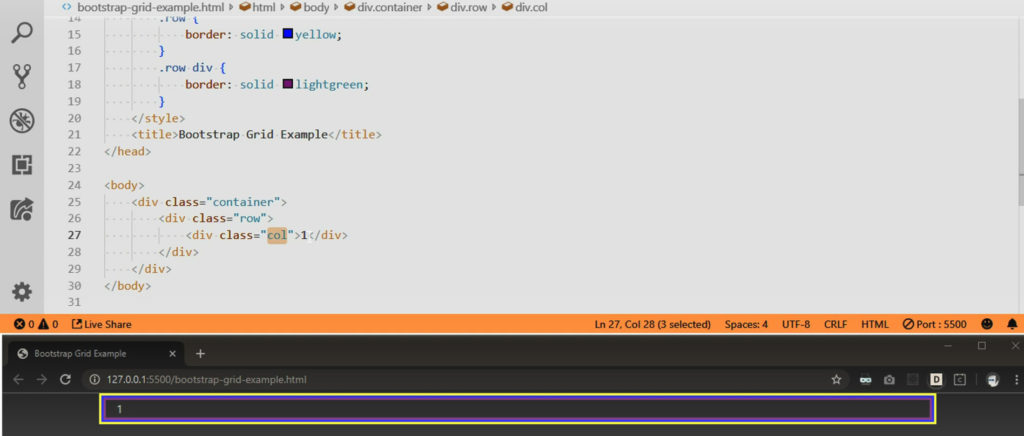
Each bootstrap row can have anywhere between one to twelve columns. A row has a potential of 12 columns! Think of it this way one single column made is actually spanning across 12 potential columns. In the example below, each column is taking up one twelfth of the row.
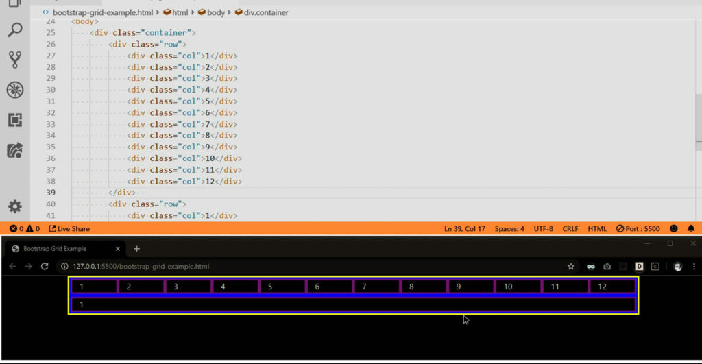
Now look at this example below. Now add this col-4 and col-8. We have one column that spans four rows and one column that spans eight rows!
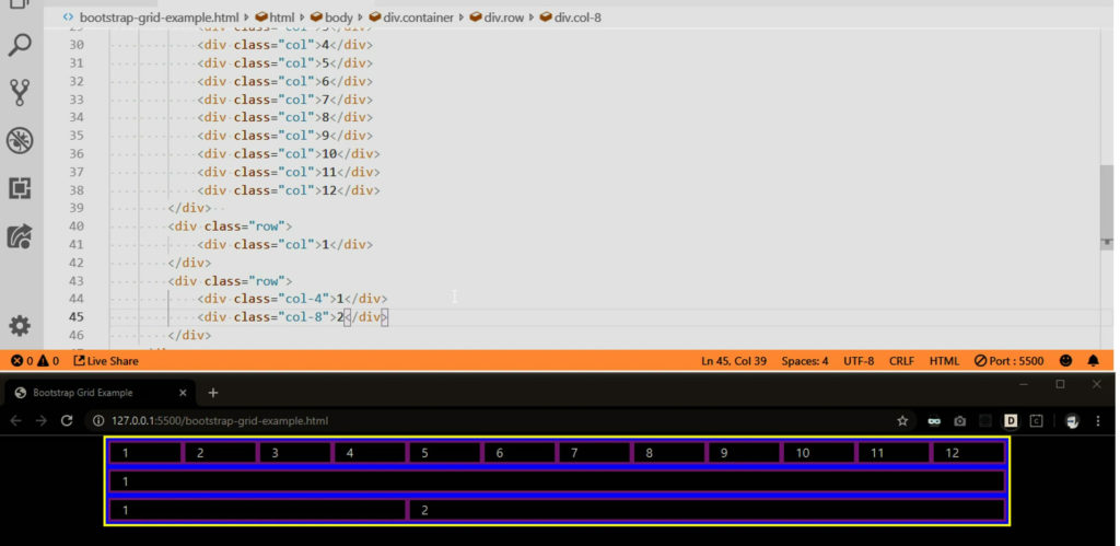
Another example to look at:

We can resize the viewport and the column widths are able to change automatically for different viewport sizes, because they take up a percentage of the rows rather than a fixed width!
Grid Basics Recap!
- Must use container, row, and column classes
- All content goes inside the column divs only
- 12 potential columns in each row
- Specify how many columns to span using <number>
- Ex: col-6 will span 6 (half) of the columns in a row
- If you leave the <number> out, Bootstrap Auto-layout will let that column take up whatever space is available
- If you leave <number> out from multiple columns in a row, they will be made equal in width
Column Breakpoints
Now quick example of applying breakpoints to bootstrap great columns. Recall that bootstrap has predefined breakpoints at certain sizes using media queries as we discussed back in responsive web design. Extra small is the default.
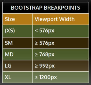
Now we add these col-md-6 and col-lg-8 for our breakpoints.
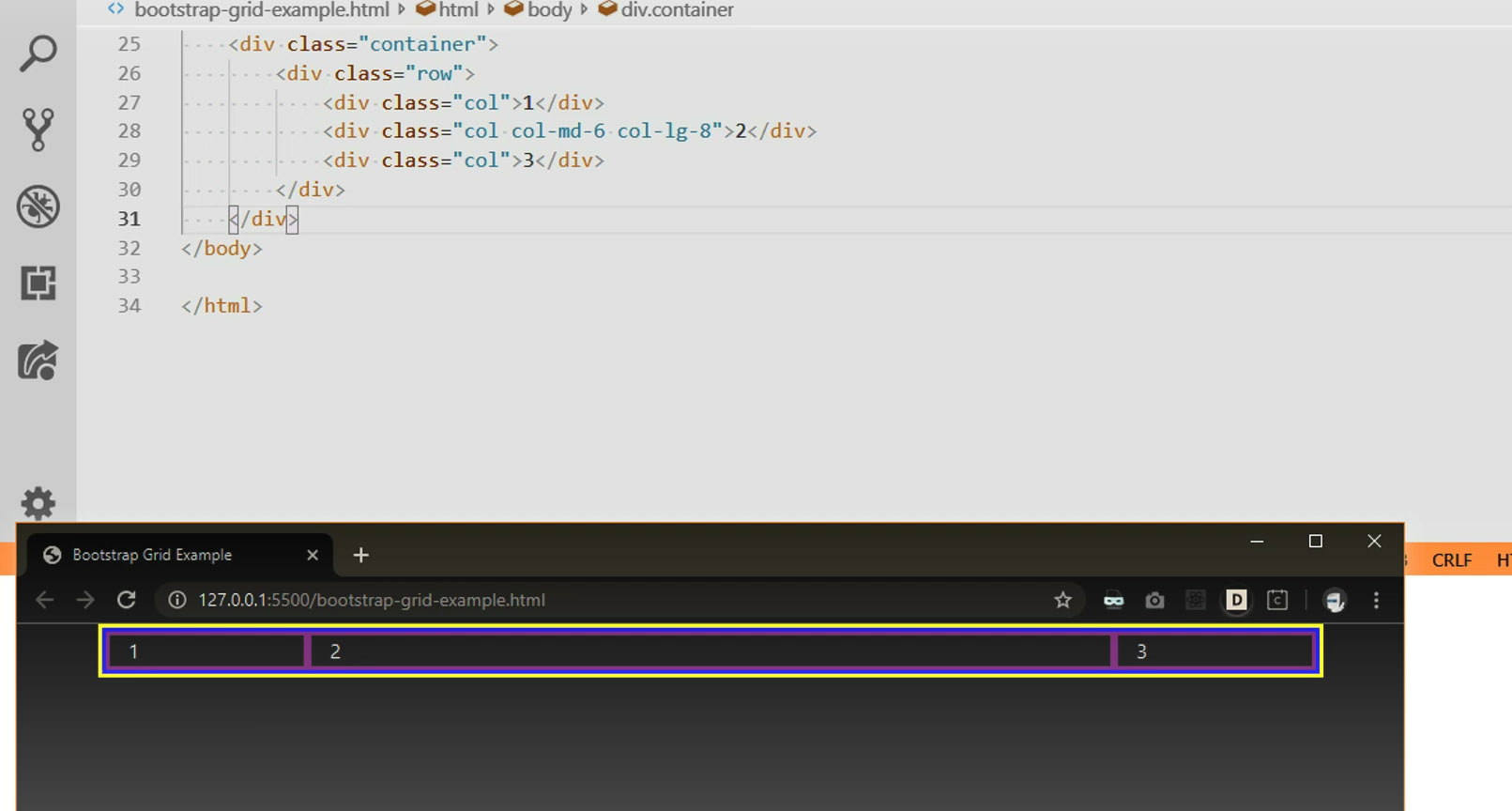
Now with this code (Codepen Campcode 2) we get this this example of a responsive web page using: container, row, and column classes
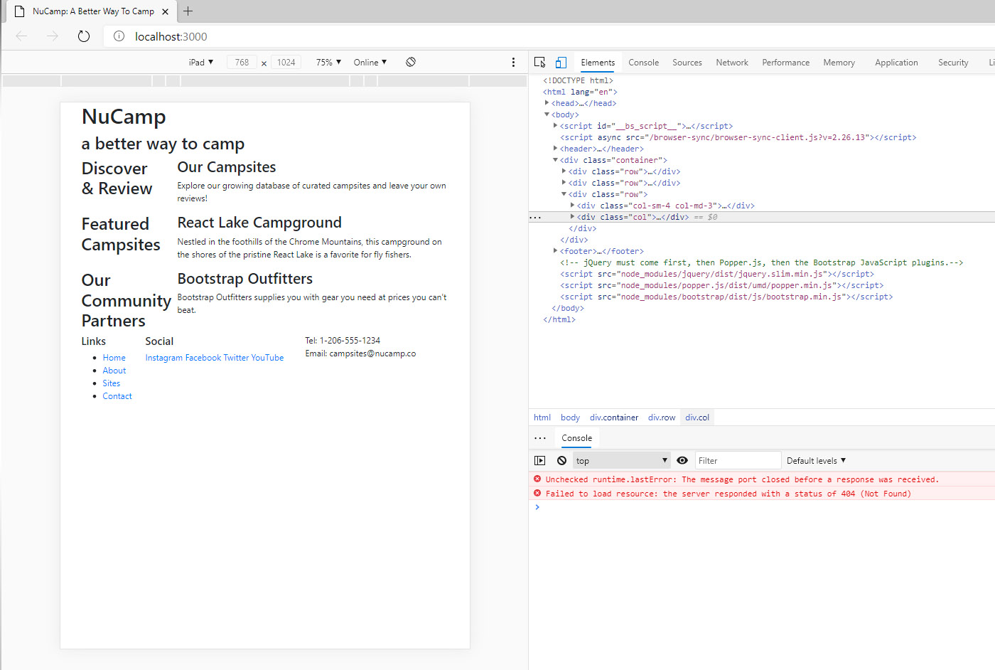
Now for some more Bootstrap classes!
Bootstrap Order-* Classes
Bootstrap has a set of responsive order classes, that allow you to change the order of columns in a row, without actually changing the order in the code.
Use order-* classes to change the order of columns in a row.
order-sm-last will only apply to small viewports and up!
Our updated code to view here! (With order-sm-last added)
Bootstrap Offset-* Classes
With an offset class you can force the column to move to the right!
Use offset-* classes to force a Bootstrap column to the right
Our updated code to view here! (With offset-1 added)

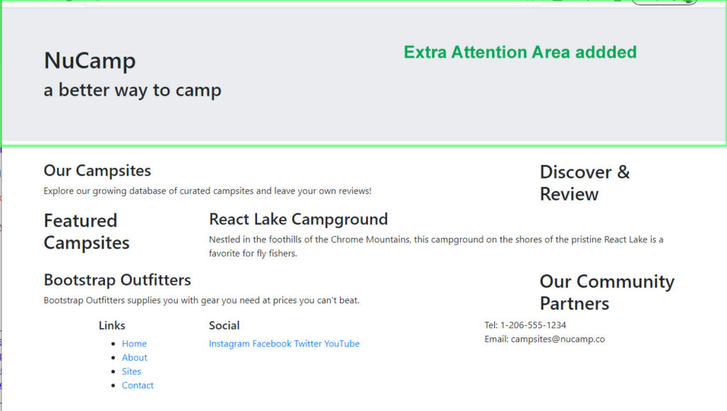
Bootstrap Jumbotron-* Classes
jumbotron is used to call extra attention to a section of the page that shows messages.
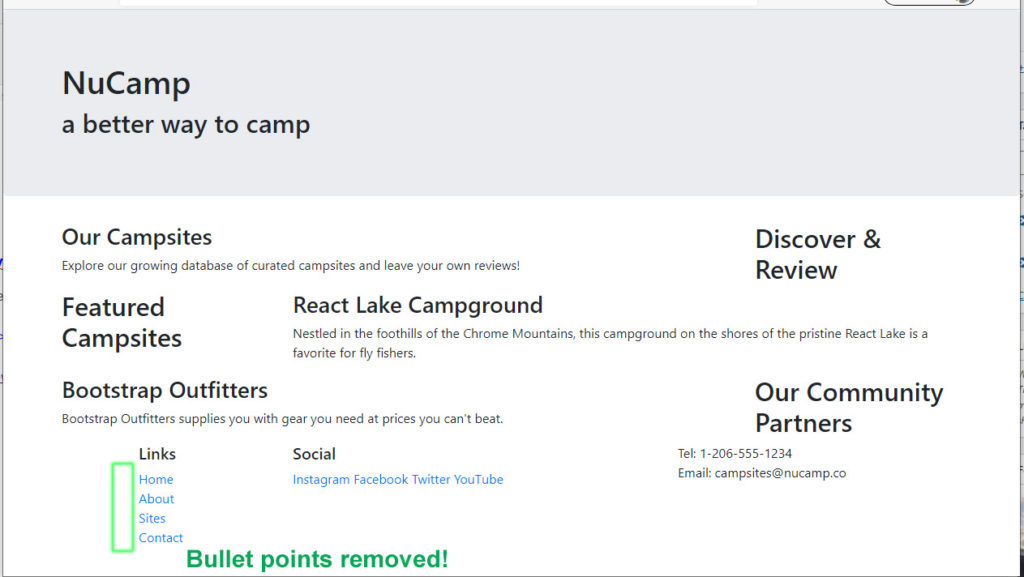
Bootstrap list-unstlyed-* Classes
Additional Resources:
- Bootstrap 4.5 Grid System – official documentation
- W3Schools – Bootstrap 4 Grid Basics
- How The Bootstrap Grid Works
- Difference Between Container and Container-Fluid in Bootstrap
- MDN – Basic Concepts of Flexbox
- A Complete Guide to CSS Grid (CSS Grid is not the same as Bootstrap Grid! CSS Grid has nothing to do with Bootstrap.)
- Bootstrap 4.5 Grid System
- Bootstrap 4.5 Order Classes
- Bootstrap 4.5 Offset Classes
- Bootstrap Jumbotron Component


